Search
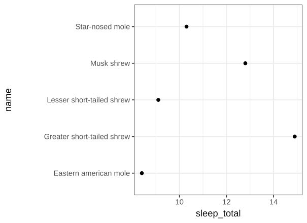
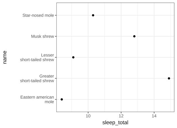
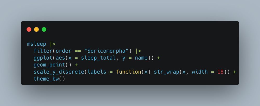
- One of my favourite #ggplot tricks is wrapping long axis labels so they don't take up so much space on your chart Image 1 - Without wrapping Image 2 - With wrapping Image 3 - Code #rstats
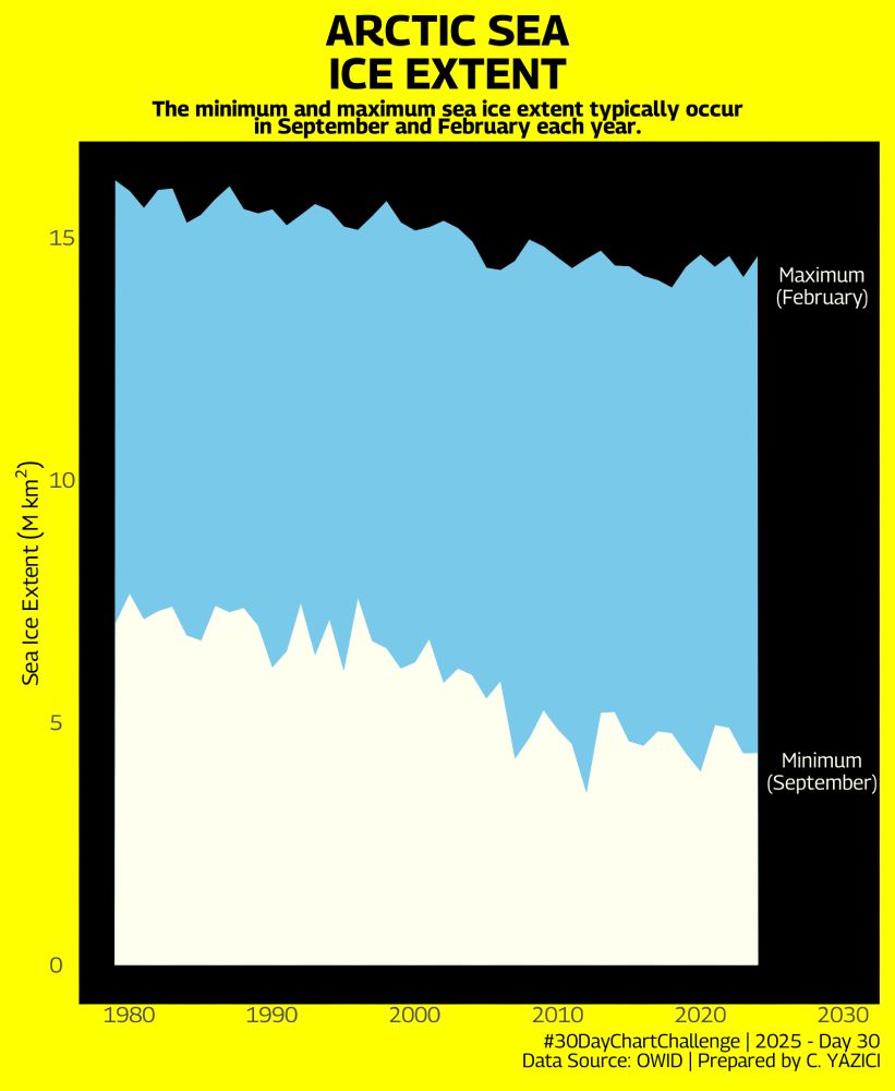
- Another late and last submission to #30DayChartChallenge Thanl you for all who organized and contributed this challenge. #Rstats #ggplot #DataViz @30daychartchall.bsky.social
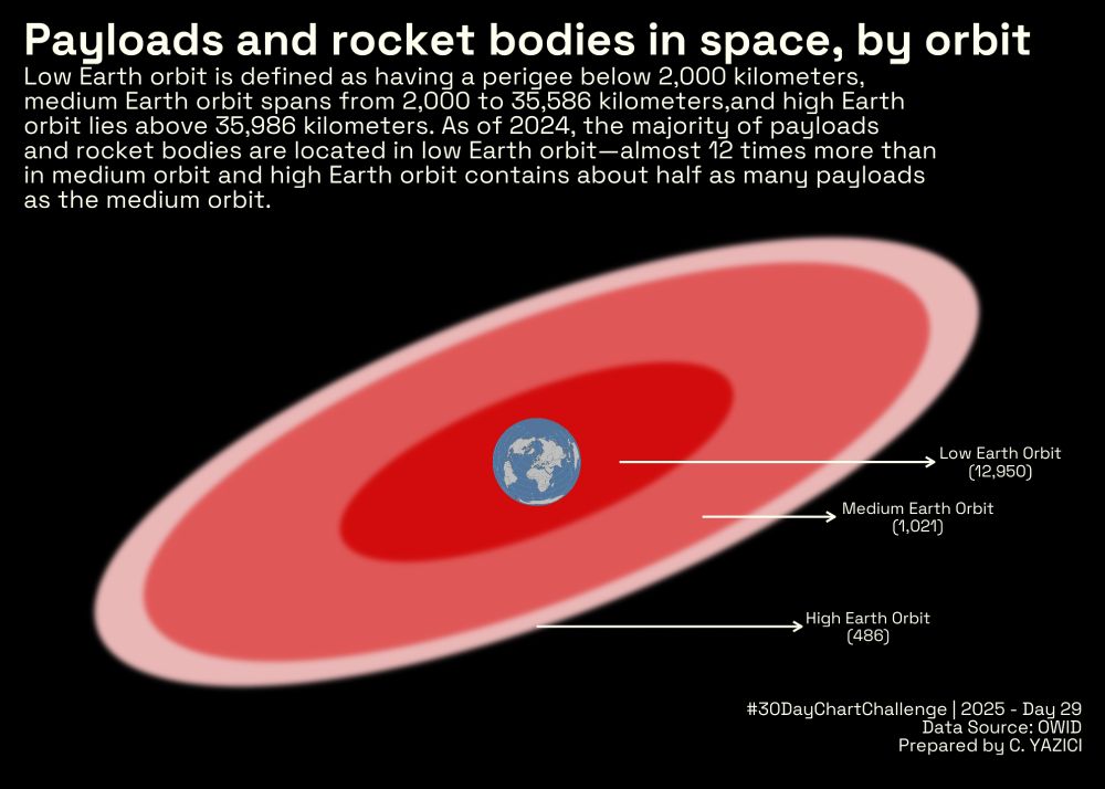
- An experimental submission to #Day29 of #30DayChartChallenge I studied the payloads and rocket bodies in space, by orbit. #ggplot #Rstats #DataViz @30daychartchall.bsky.social
- #Day28 of #30DayChartChallenge with the prompt #inclusion I studied the #ratings of #chocolates which include salt as the #ingredient #DataViz #ggplot #Rstats @30daychartchall.bsky.social
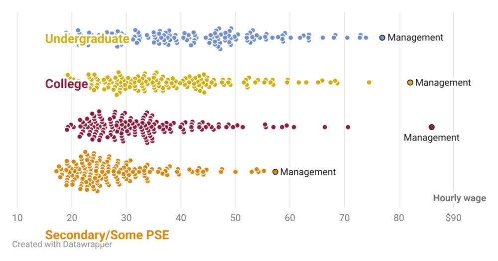
- More fun with @datawrapper.de scatterplots and #rstats. Here's a 𝐛𝐞𝐞𝐬𝐰𝐚𝐫𝐦 plot w/ average wages by education and job type. Works by pulling layer data from a #ggplot, then uploading w/ the DW API. Appears to work for geoms with points, straight lines/areas, & text. www.datawrapper.de/_/eK8uJ/
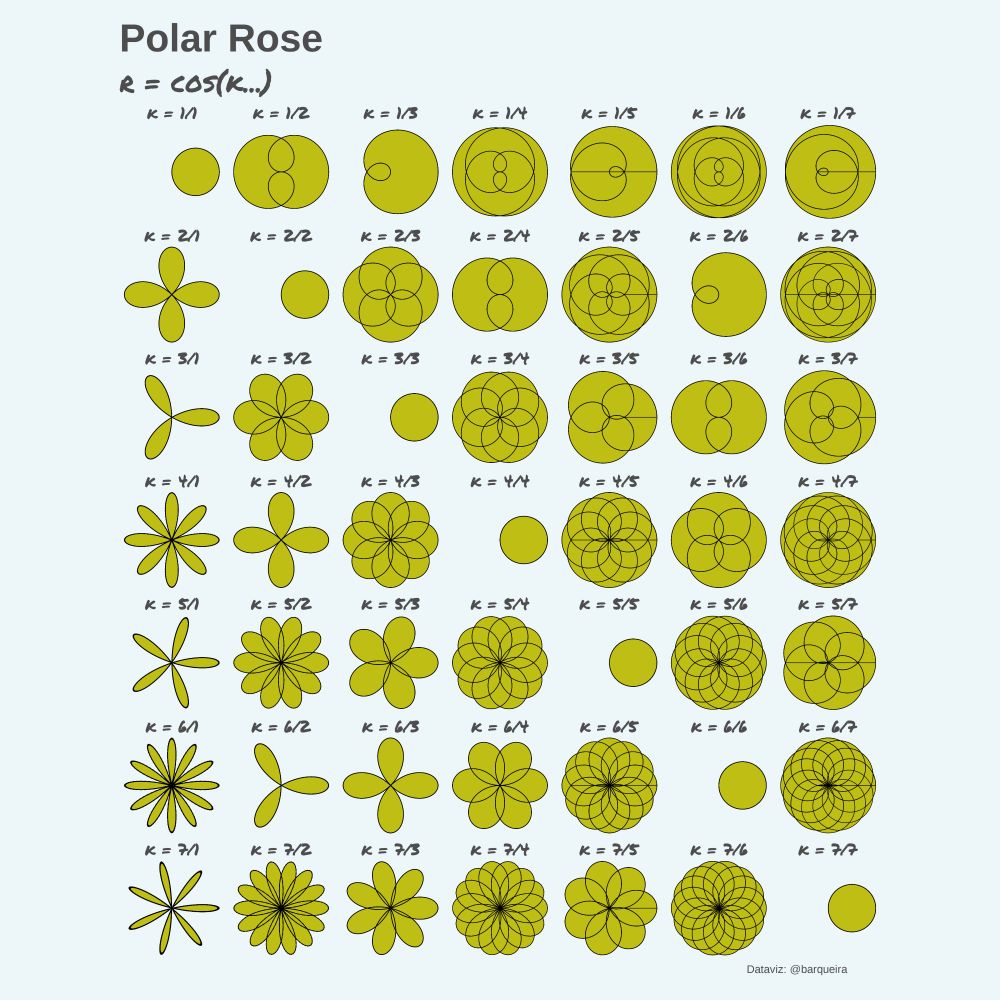
- A rose curve is a sinusoid characterized by the equation r = cos(kθ) or r = sin(kθ) in polar coordinates. #rstats #dataviz #ggplot #ggplot2 #math