Search
- The 30 day chart challenge is complete! You can now see all my recent charts and their stories in 1 place: didoesdigital.com/30-day-chart... #30DayChartChallenge
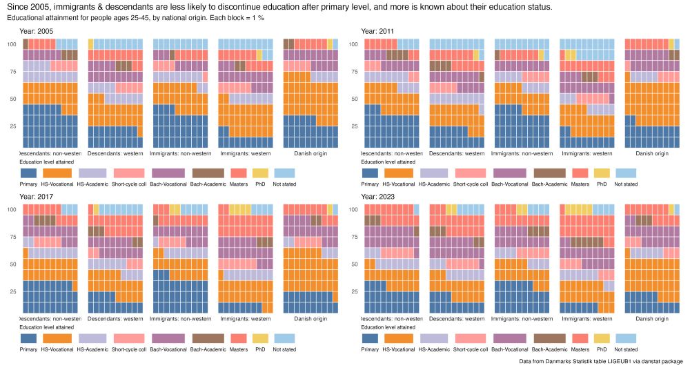
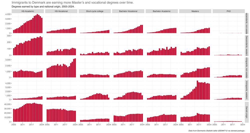
- A bit late for my last #30DayChartChallenge some #rstats #dataviz for day 28's prompt - inclusion. Looking at the immigrant experience in the 🇩🇰 education system tl/dr is more attainment beyond primary level & immigrants rely on vocational degs for social mobility www.gregdubrow.io/posts/30-day...
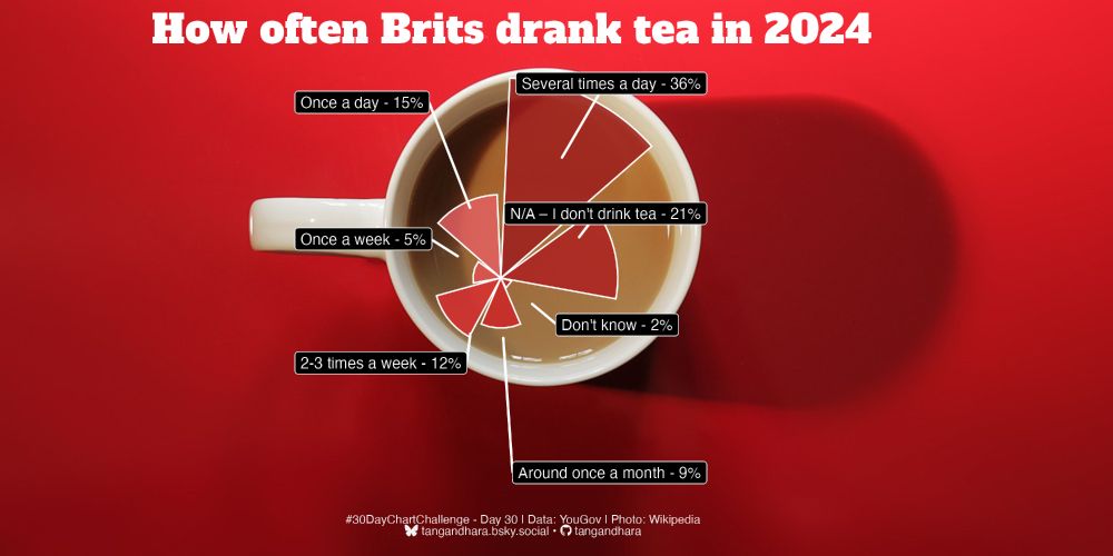
- #30DayChartChallenge - Day 30: National Geographic theme The final one! I had no idea what the style was so I Googled and found some interesting charts about tea from NatGeo which I used as inspiration. Not happy with the placement of the chart but I quite like the final result. #rstats #dataviz
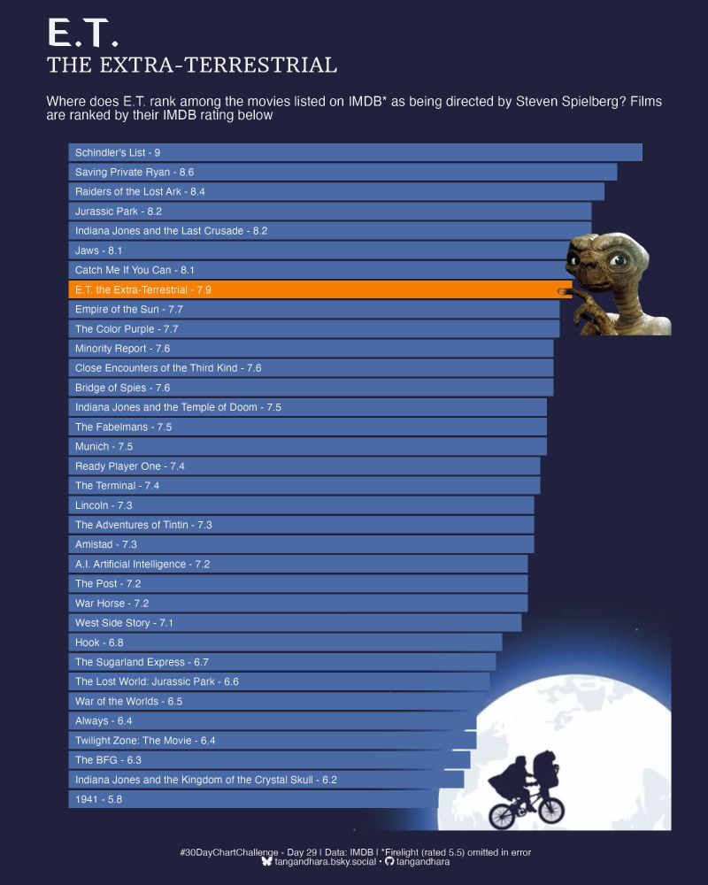
- #30DayChartChallenge - Day 29: Extraterrestrial I chuckled putting this one together for lots of reasons but especially because I loved E.T. as a kid. All data was from IMDB and after failing at scraping it, the {datapasta} was a lifesaver! #rstats #dataviz
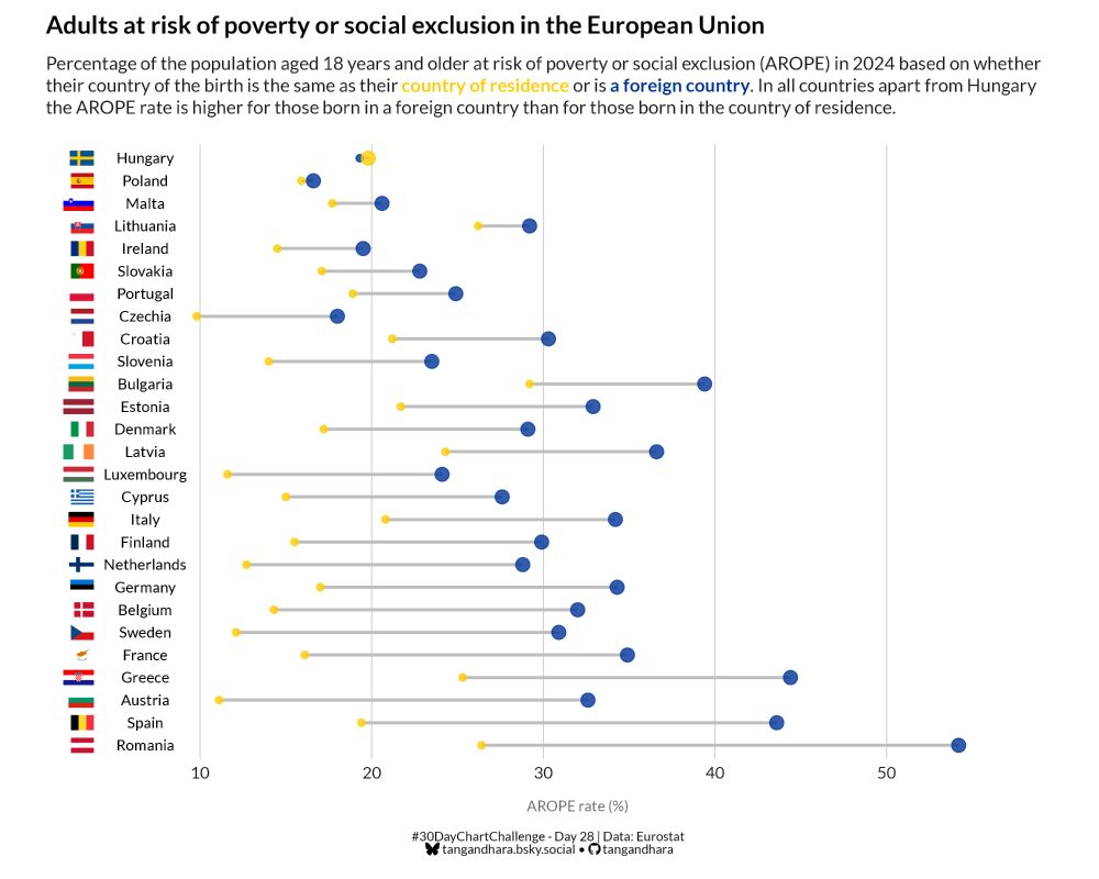
- #30DayChartChallenge - Day 28: Inclusion What's the opposite of inclusion? Exclusion and this chart compares the rate of adults at risk of poverty or social exclusion in the EU based on their country of birth. #rstats #dataviz
- #30DayChartChallenge 2025... it's a wrap! 30 days... 30 visualizations... At some point, I hope to share some of my reflections... but for now, thank you for all your support! 🙏 Congrats to all of the participants! It was great seeing all of your work! Link: public.tableau.com/app/profile/...
- Another late and last submission to #30DayChartChallenge Thanl you for all who organized and contributed this challenge. #Rstats #ggplot #DataViz @30daychartchall.bsky.social
- Still slowly working away at #30DayChartChallenge in my own time. So here's day 15 - Complicated which involves one of the more complex GSAP plugins - morphSVG to manipulate SVG shapes. Made with Svelte + GSAP. Still super janky but here's the code: github.com/schubert-da/...
- 📊 30 Day Chart Challenge Blog Post 📊 Featuring: 🧠 What I've learned 🤩 My favourite charts 🤞 Advice if you're thinking about participating! Link: nrennie.rbind.io/blog/30-day-... #DataViz #RStats #Python #D3 #30DayChartChallenge
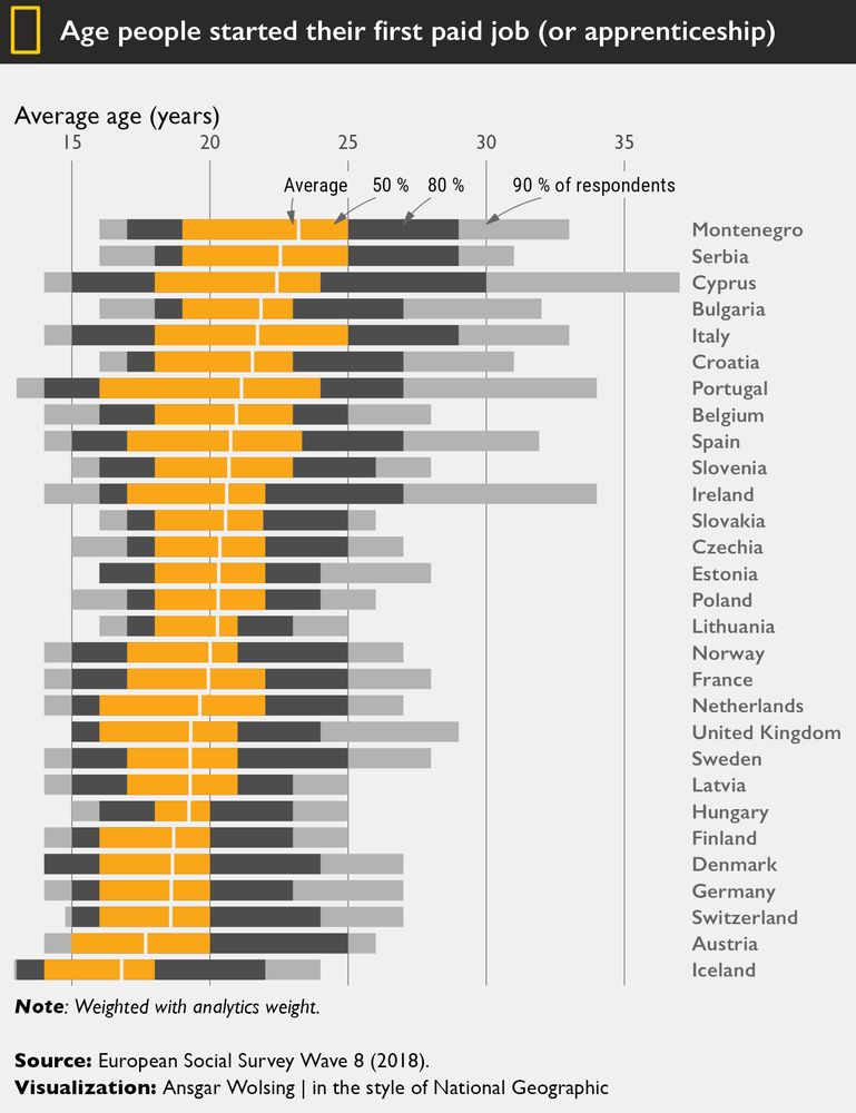
- Age at which people in European countries start their first paid job. 🧑🎓🧑🏭👩⚖️ (I didn’t want to miss the last theme day of the challenge.) #30DayChartChallenge #Day30 Theme Day: National Geographic 📊 #rstats
- Thanks to everyone who contributed their #DataViz, celebrated others’ work, and shared encouragement — thank you all simply for dedicating your time, in whatever context, to help make the 5th edition of the #30DayChartChallenge such a success 👑
- 0 days, 30 prompts - it's a wrap! 🎉 Huge thanks to everyone who joined the #30DayChartChallenge - daily, occasionally, or cheering from the sidelines. We're amazed, inspired, and above all, grateful for all the creativity, learning, and sense of community! 💛 #dataviz #datavisualization
- And just like that, April is done. The #30DayChartChallenge is over. 🙁
- #30DayChartChallenge - Day 26: Noise Almost there! This one is all about people complaining about noise from loud music and parties in New York City in 2020 and 2024. The colour scheme is inspired by the yellow of the city's taxis. #rstats #dataviz
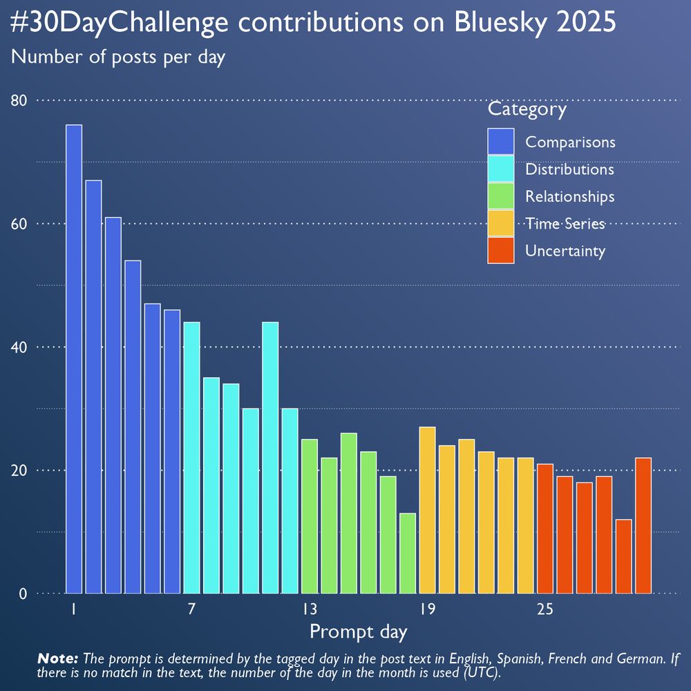
- We're happy to see so many charts shared on Bluesky. ♥️ So, we prepared a chart, too. It shows the number of contributions for each prompt on Bluesky this year. #30DayChartChallenge
- 0 days, 30 prompts - it's a wrap! 🎉 Huge thanks to everyone who joined the #30DayChartChallenge - daily, occasionally, or cheering from the sidelines. We're amazed, inspired, and above all, grateful for all the creativity, learning, and sense of community! 💛 #dataviz #datavisualization
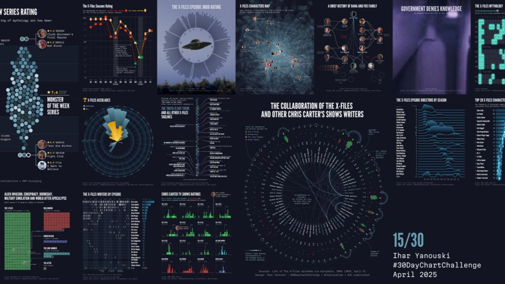
- #30DayChartChallenge is over, happy to make 15/30 😌 Many thanks to the organizers and all the participants 👏 You can find all my contributions here: yanouski.com/work/30-day-... Conspiracy mode deactivated 🛸 #xfiles #dataviz #datavisualization
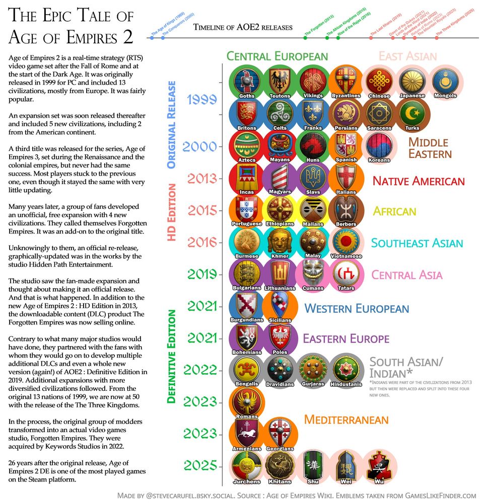
- #30DayChartChallenge Day 30 : NetGeo Theme Day [war horn in the distance] The story of #AgeOfEmpires2 since its original 1999 release and all the available civilizations to play with and attack others, group by region and version. #rstats #videogames
- #30DayChartChallenge | Day 30 - National Geographic For this last challenge, I moved away from the main idea and the prompt, but I liked the result. Very happy to have done all the challenges. For those who want to see the source code: github.com/juanchiparra...
- Day 30 of the #30DayChartChallenge - National Geographic IUCN Red List data on species threatened with extinction Made using #rstats with helpful tips from Albert Rapp on using symbols in the subtitle instead of a legend www.youtube.com/watch?v=X1gk... albert-rapp.de/posts/ggplot...
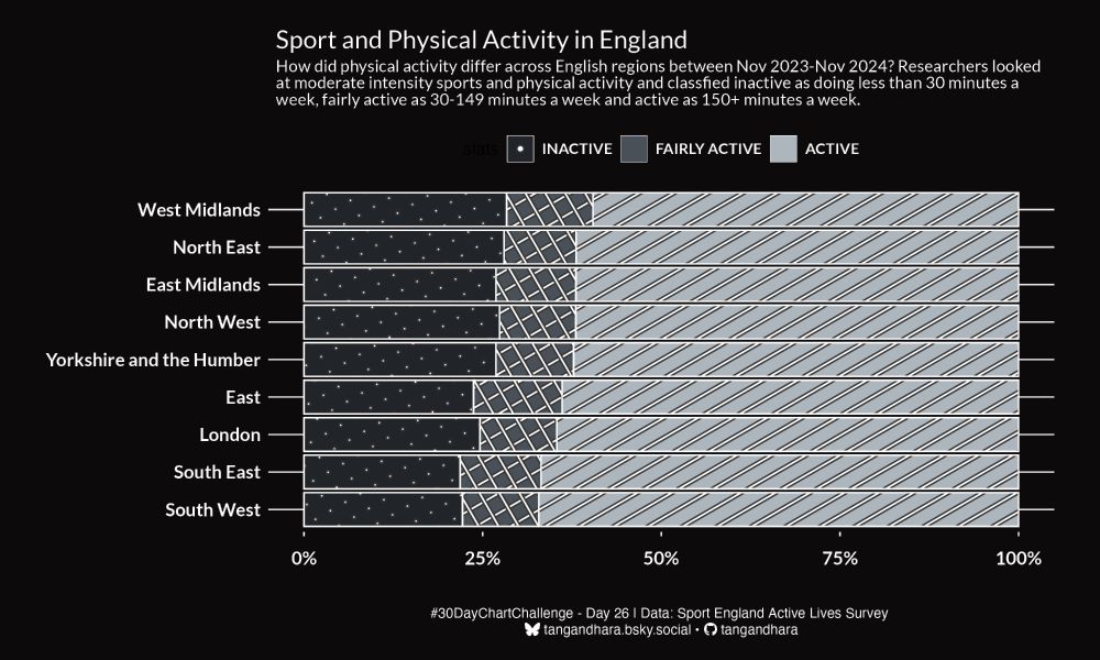
- #30DayChartChallenge - Day 26: Monochrome Here's how physical activity differed across England in 2023-24. #rstats #dataviz
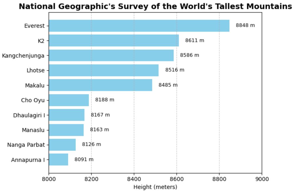
- Day 30 of #30DayChartChallenge #datavis The prompt today is National Geographic. Here are the tallest mountains according to Nat Geo. ( I made it 30 days straight 😎 !!)
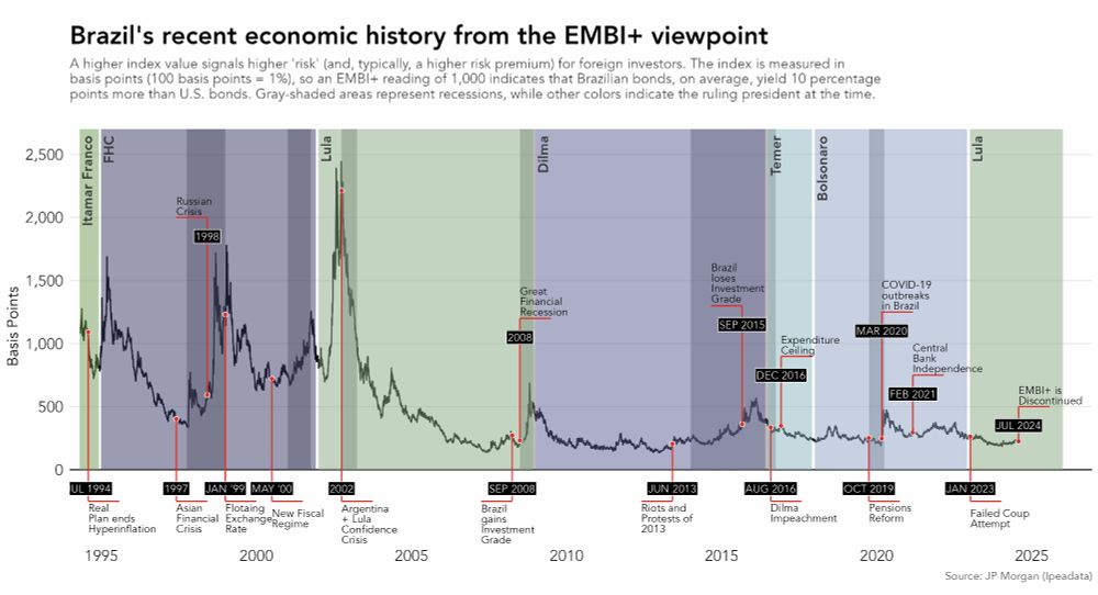
- Still missing some plots, but wanted to share this one. Day 25 #30DayChartChallenge | Uncertainties: Risk The plot shows the "Brazil Risk" measured by the EMBI+ and highlights key economic/political events. This index broadly measures the risk that foreign investors face when investing in Brazil.
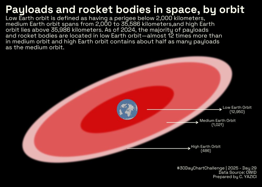
- An experimental submission to #Day29 of #30DayChartChallenge I studied the payloads and rocket bodies in space, by orbit. #ggplot #Rstats #DataViz @30daychartchall.bsky.social
- I went for monochrome and it ended up looking like noise. Is it cheating to add both prompts 😅 #30DayChartChallenge bsky.app/profile/eleo...
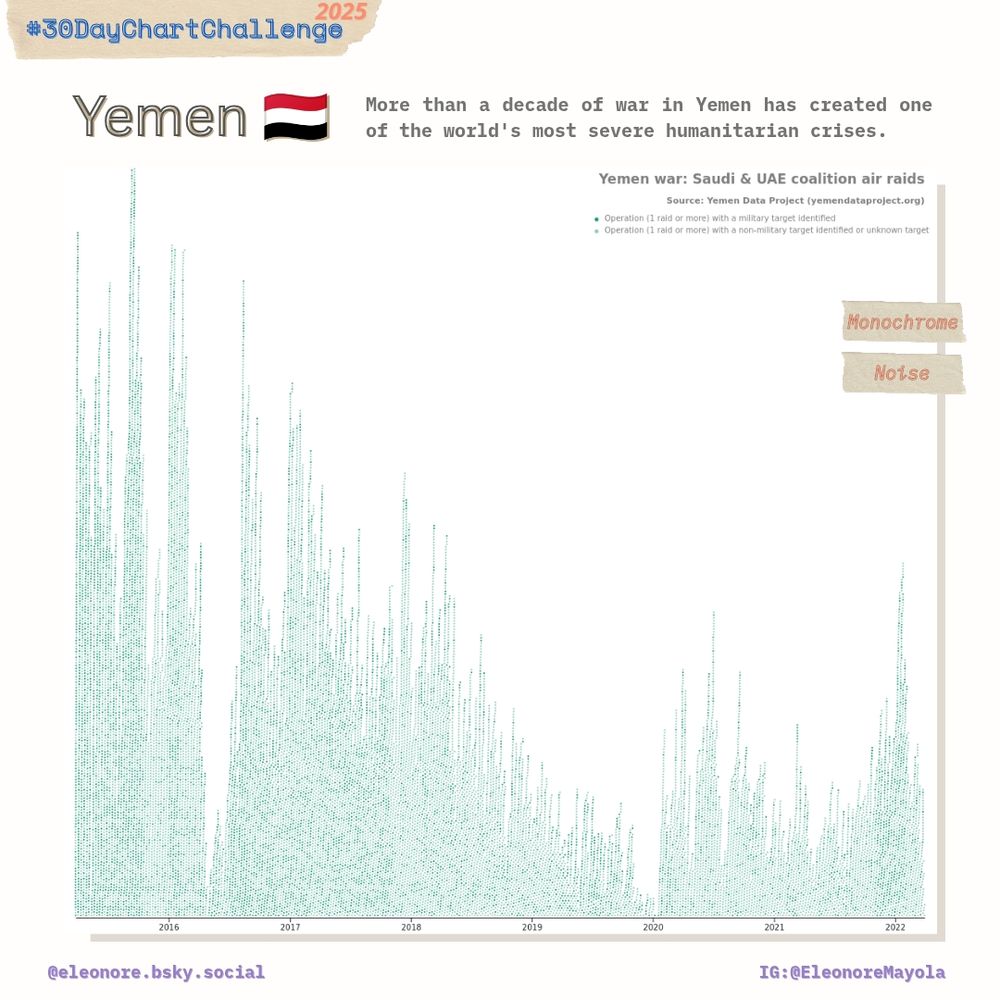
- I decided to use a D3 beeswarm chart because I underestimated the number of air raids over Yemen (2015 -2022 by the Saudi/UAE coalition). #30DayChartChallenge 📊
- I decided to use a D3 beeswarm chart because I underestimated the number of air raids over Yemen (2015 -2022 by the Saudi/UAE coalition). #30DayChartChallenge 📊
- #Day28 of #30DayChartChallenge with the prompt #inclusion I studied the #ratings of #chocolates which include salt as the #ingredient #DataViz #ggplot #Rstats @30daychartchall.bsky.social
- #30DayChartChallenge | Day 30 - National Geographic Theme | Great Salt Lake 🛰️ #dataviz #remotesensing #GEE
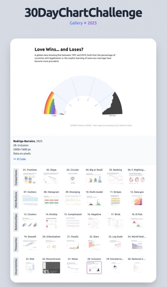
- The #30DayChartChallenge is DONE! 🥳 My R adventure by the numbers: 30 unique charts, 50+ datasets, 16 new packages, and countless "why won't this text align?!" moments. barreiro-r.github.io/30-day-chart... #DataViz #RStats
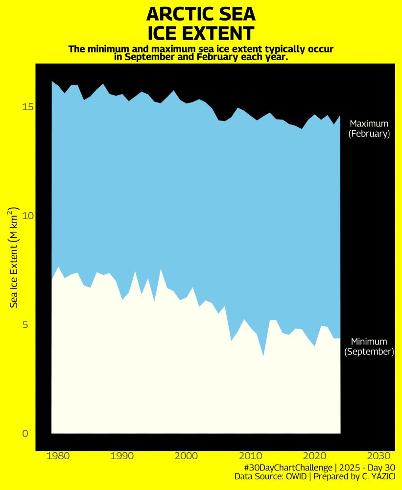
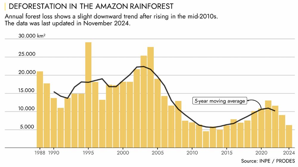
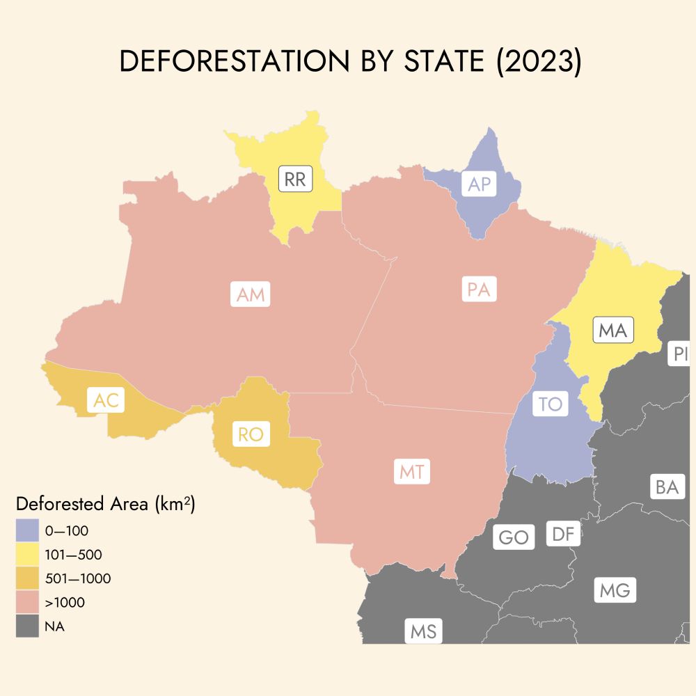
- Day 30 #30DayChartChallenge | National Geographic This chart shows the deforestation of the Amazon rainforest over the years, based on satellite imagery. This year's COP30 will take place in Belém, Pará—a state that has consistently ranked among the top 2 in deforestation, since 1988.