
Kyle Walker
Demographics | Geospatial | Data Science | Open Source
- Manhattan demographics mapped as a 3D, rotatable layer stack. There are endless possibilities for creative visualization with R and the {mapgl} package. Run the code: gist.github.com/walkerke/b7f... Then read the mapgl docs: walker-data.com/mapgl #rstats #gis #datavisualization
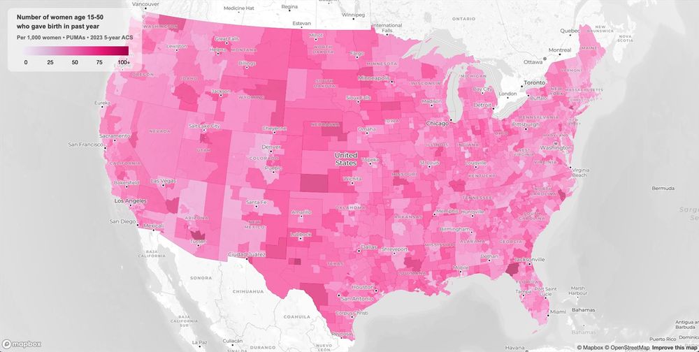
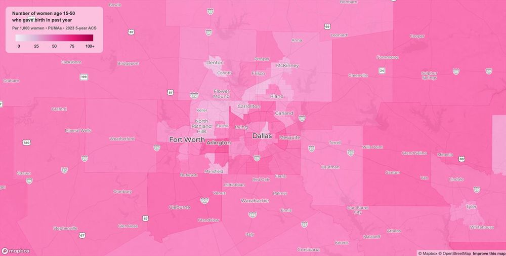
- Yesterday, I posted a "Mother's Day" map showing variations in birth rates for women age 15-50 across the US. You can browse the interactive map here: walker-data.com/maps... A few observations:
-
View full threadWithin metro areas, higher-income areas tended to have lower fertility than lower-income areas, though among affluent suburbs, faster-growing areas outpaced mature ones. The lowest-fertility areas within metros, unsurprisingly, are those with large student populations.
- These maps are built with @Mapbox and R (#rstats) from American Community Survey data. Want to learn more about the tech and data? Check out my blog: walker-data.com/blog
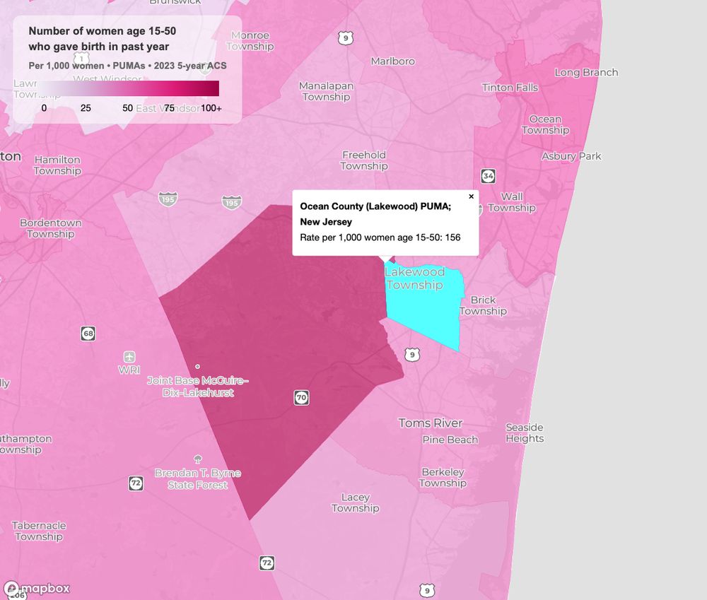
- Ocean County (Lakewood), New Jersey had the highest fertility in the US; approximately 156 of every 1,000 women age 15-50 in this PUMA had given birth in the past 12 months.
- The lowest-fertility PUMA? The Fenway / Brighton area in Boston, with only 7 women per 1000 giving birth in the past year.
- Happy Mother's Day to all the moms out there! Mapped here: number of births in the past year among women age 15-50 per 1000 women in that age range. Data: 2019-2023 ACS by PUMA. #rstats Code: github.com/walkerke/map... Explore the map: walker-data.com/maps/happy-m...
- I'm implementing a new feature in {mapgl}. I started with Claude Code, and I was ready to post this morning about how "Claude did it while I was cleaning my garage!" But - Claude's solution didn't work, and I burned through a bunch of credits.
- So I wrote the code myself, and it worked after a couple tries. There's a lesson in there somewhere...
- {ellmer} is the framework that can take your work with large language models to the next level. It's an R package that provides a common interface to popular #LLM APIs like OpenAI, Anthropic, and Gemini as well as local models through Ollama. With ellmer, you can:
- 🤖 Manage #GenAI pipelines from R and connect AI to your data analysis / data sources; 🤖 Set up system prompts / custom LLM instructions; 🤖 Pass images and PDFs to LLM APIs; 🤖 Use tool calling and get data back as structured outputs; 🤖 Power chatbots in your Shiny apps!
- I've been using ellmer to great success in my projects; it powers large-scale document processing, automated data extraction, interactive user experiences in apps, and a whole lot more. Get started here: ellmer.tidyverse.org... #rstats
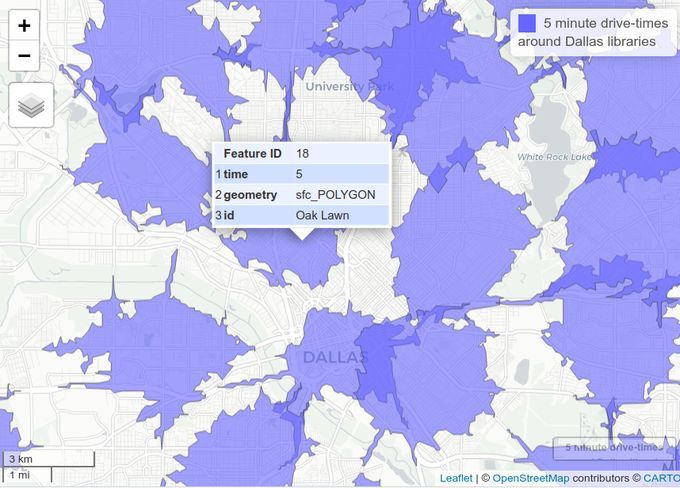
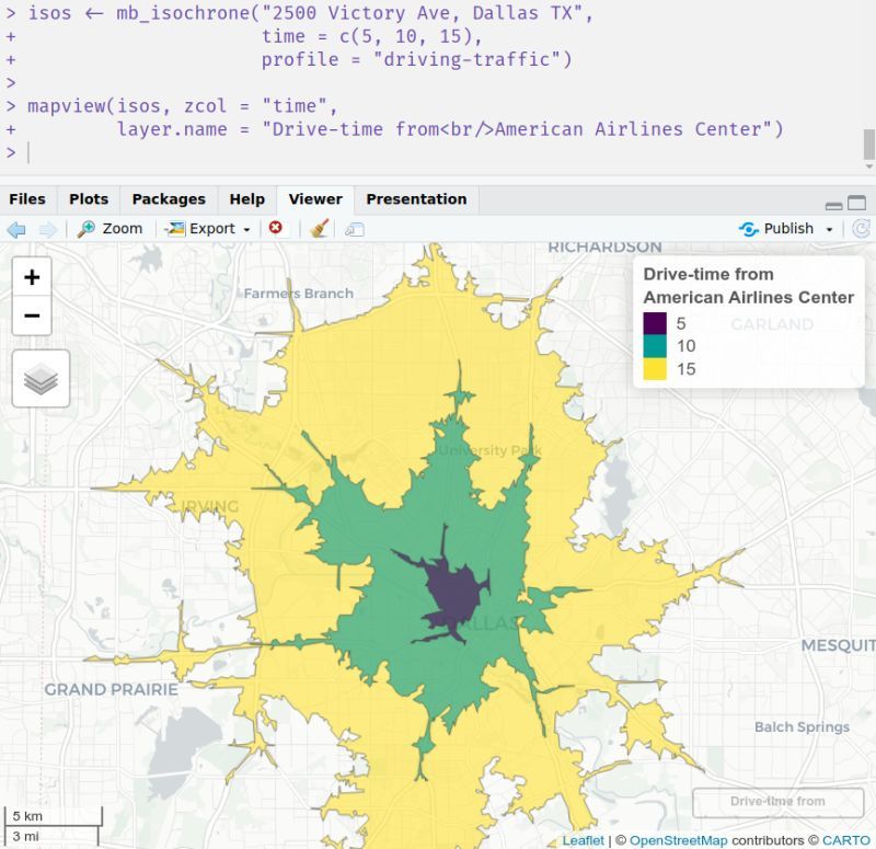
- Isochrones show you the reachable area from a location for a given travel mode. In #rstats, creating isochrones with @Mapbox web services is easier than you think.
- [Not loaded yet]
- Valhalla is great, Mapbox hired their whole team a while back and I believe runs their tech under the hood (though I don't know how much of their team is still there). Valhalla has a steep learning curve; if you know Docker, that makes it a bit easier to work with.
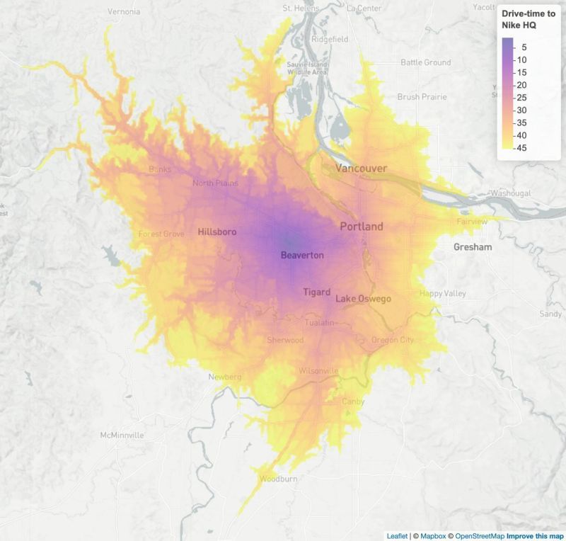
- 🌎 You can even integrate isochrones into more advanced workflows. One of my favorites is the "accessibility surface" - a raster that shows the travel time from any location within an hour. mapboxapi handles Mapbox's rate limits for you, so you can calculate without worry!
- Try out the script here to get started: gist.github.com/walk... And check out the package docs: walker-data.com/mapb... If you are interested in how you can leverage isochrones in your application / business, don't hesitate to reach out!
- 🌎 Alternatively, if you have an sf POINT object you can calculate isochrones in bulk over each location. Use the `id_column` argument to associate your isochrones with your input points.
- 🌎 If you want to measure driving distances instead of times, swap in the `distance` argument or use a different travel profile. Supported profiles are "driving-traffic", "driving", "cycling", and "walking".
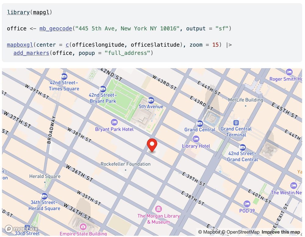
- 🌎 In the mapboxapi R package, the function `mb_isochrone()` helps you calculate isochrones with some extra features to make your life easier. For example, `mb_isochrone()` is integrated with Mapbox's geocoder so you can create isochrones directly from addresses!
- This may be a contrarian take, but I think it’s incumbent upon us as professors to figure out new ways to promote students’ critical thinking in the AI age. Which may well mean overhauling the assignments we’ve been using for the past decade.
- Are you interested in starting a consulting business or side hustle, but don't know how? There is likely something that you know better than 95% of people - possibly 99% - that they want to know about, could find very useful, or could save them time.
-
View full threadStay consistent, and people will start noticing! Are you uncomfortable sharing content? We all are. But not achieving your financial goals is also uncomfortable, so choose your discomfort.
- My consulting site is here, feel free to check it out: https://walker-data.com I built the site with Quarto and#rstats and host on GitHub Pages, which has worked well for me!
- Start posting about that thing regularly; you probably already have content to share. In your posts, direct people to a website where they can learn about your expertise in that area in more detail. This might be a blog, professional page, or both.
- There are a lot of options out there for geocoding. I'm particularly fond of the interface I wrote to the Mapbox geocoder in the R {mapboxapi} package. It includes: 🌎 Forward and reverse geocoding; 🌎 Batch geocoding with 100k free queries / month; 🌎 A Shiny input with autocomplete for your apps!
- I won an NSF grant in 2017. It funded public software tools like tidycensus that have been downloaded millions of times, saving people countless hours of work and producing considerable ROI. Behind each canceled grant lies a potential, but unrealized, story like that. www.npr.org/2025/05/02/n...
- [Not loaded yet]
- yes it was! I had an early v1 going as the grant was starting in summer 2017, but the grant supported basically everything you see in the modern version of the package
- Story maps built with R and {mapgl} are full-fledged Shiny apps. Use Shiny inputs and outputs to build "choose your own adventure" style map stories that reflect viewer choices. Try out this example and learn more: walker-data.com/mapgl/articl... #rstats #gis #datavisualization
- One of my favorite features of the {mapgl} #rstats package is its flexible interface for hover effects. Specify a named list of `hover_options()` and you can change the hovered-over feature's look in many different ways. Try out this tutorial: walker-data.com/mapgl/articl...
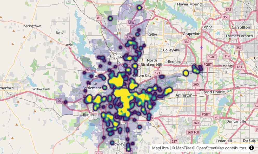
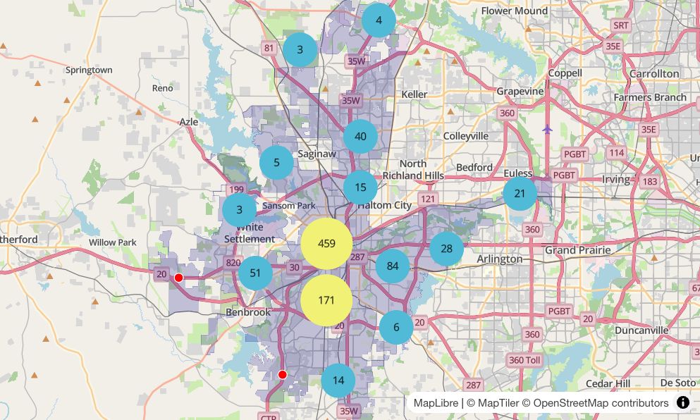
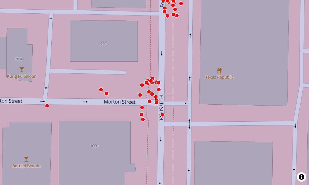
- On the blog: strategies for mapping dense point data in R. Learn how to use: 🌎 Circle clusters 🌎 Dynamic heat maps 🌎 Point jittering for same-location events Read the post: walker-data.com/post... #rstats #gis #datavisualization
- A data-driven location strategy can give you a critical edge in business and real estate over your competitors. However, it can be difficult to know where to start, especially if you are optimizing your expenses. Read on about FREE resources I find indispensable in my work:
-
View full threadTo summarize, these FREE datasets can be invaluable to your business strategy: - ACS: lnkd.in/gez4dhP5 - LODES: lnkd.in/g_R65qRy - Overture Maps: overturemaps.org/ - HIFLD: lnkd.in/gpe4rh9M
- Need help getting started with these resources? Don't hesitate to reach out! https://walker-data.com
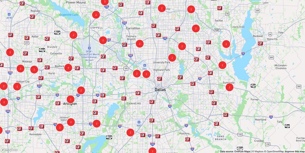
- 🌎 The Overture Maps "places" dataset is a global point-of-interest layer supported by tech giants like Meta, Amazon, and Microsoft. You can pull retailer locations (and much more) from a dataset of over 55 million global POIs. Example: lnkd.in/gVyBsJRw
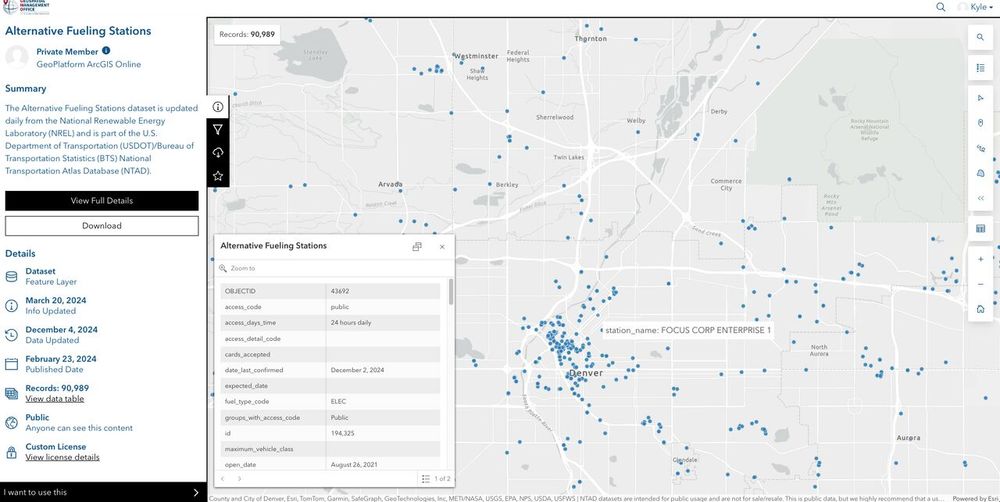
- 🗺️ The US DHS's Homeland Infrastructure Foundation-Level Data, or HIFLD, makes data on US "critical infrastructure" available. Get data on health care (hospitals), energy infrastructure (fueling stations, pipelines), and much more. Example: lnkd.in/gU94pvSf
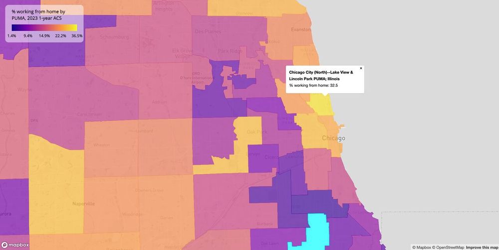
- 📊 The American Community Survey, or ACS, is the best resource for granular demographic data in the United States. Get information on population structure, income, housing, education, and so much more all the way down to the neighborhood level. Example: lnkd.in/gYb9QX-z
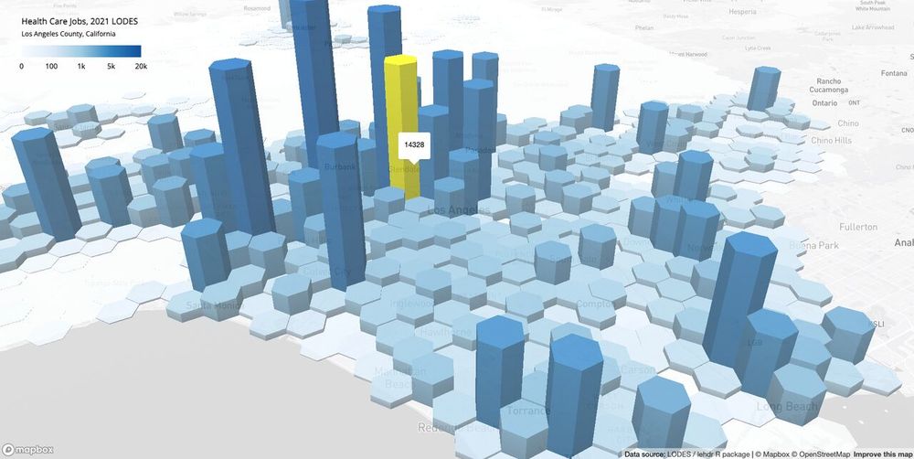
- 📈 The LEHD Origin-Destination Employment Statistics, or LODES dataset, is a valuable dataset for high-resolution analysis of the US labor market. Analyze on worker & resident locations - and the flows between them - down to the city block. Example: lnkd.in/guCYj2mZ
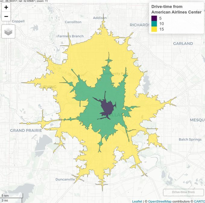
- I'm a huge fan of the @mapbox.com stack for interactive storytelling. Shown here: 🌎 10-min drive radius at 5pm vs midnight via Isochrone API; 🌎 Day/night rendering in Mapbox GL JS 🌎 Interactive side-by-side comparison So powerful for smarter location decisions & stakeholder communication!
- If you are making web maps, understanding distortion is critical. Here, we use @maplibre.org GL JS's draw control to draw two rectangles of seemingly similar size... ...then use MapLibre's new globe control to reveal that the two shapes are actually much different.
- Want to try this out for yourselves? You don't need much R code: library(mapgl) maplibre(style = maptiler_style("outdoor")) |> add_globe_control() |> add_draw_control()
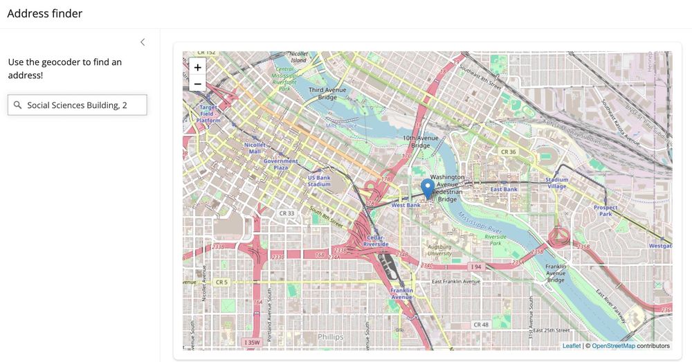
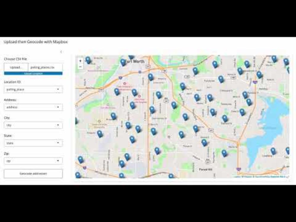
- On the blog: drag-and-drop batch geocoding with @mapbox.com, R, and Shiny Read the post: walker-data.com/posts/shiny-... www.youtube.com/watch?v=swWL...
- Try it out: geocode an address with @mapbox.com, then have @anthropic.com's Claude Sonnet explain the location to you. Live app here: walkerke-ai-location-explorer.share.connect.posit.cloud
-
View full thread
- How it works: a response from the Mapbox geocoder is used as a structured input to the Anthropic API, which then uses that information + its own knowledge to write a short summary about that place. I explain more in my blog post here: walker-data.com/posts/ai-loc...
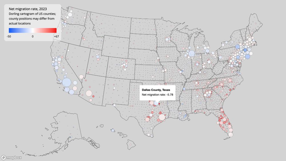
- From the 2024 #30DayMapChallenge: an interactive Dorling cartogram of net migration rates by US county in 2023. Built with @mapbox.com and R. Interact with the map: walker-data.com/map-challeng... Make it yourselves: github.com/walkerke/map...
- On the blog: side-by-side synced maps, comparison maps in Shiny, and much more in the latest release of {mapgl}. Read the post: walker-data.com/posts/mapgl-... #rstats #gis #datascience
- On the blog: automated data acquisition and map production pipelines in R walker-data.com/posts/iterat... #rstats #gis #datascience