powerful
thoroughly great. the contrast between color and structure, the balance of simplicity and intricacy (but not so intricate as to be fussy). amazing.
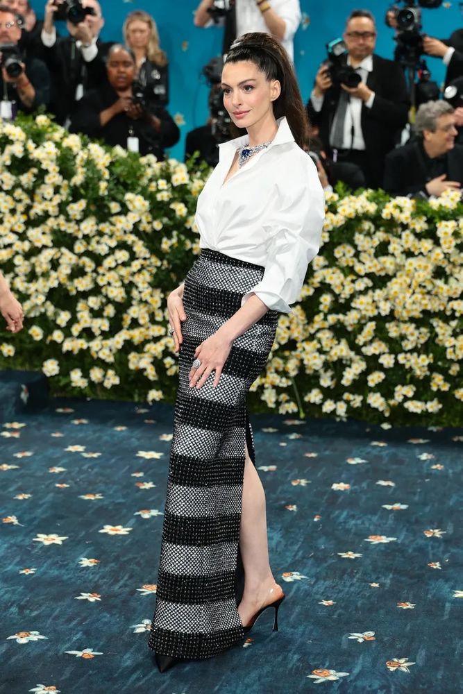
I do like a punchy color paired with simple black and white
some excellent color work happening here
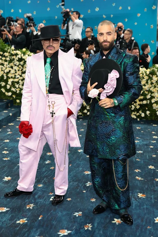
*banging clipboard* zoot suits zoot suits zoot suits zoot suits zoot suits
(LOVE the colors)
incredible work here
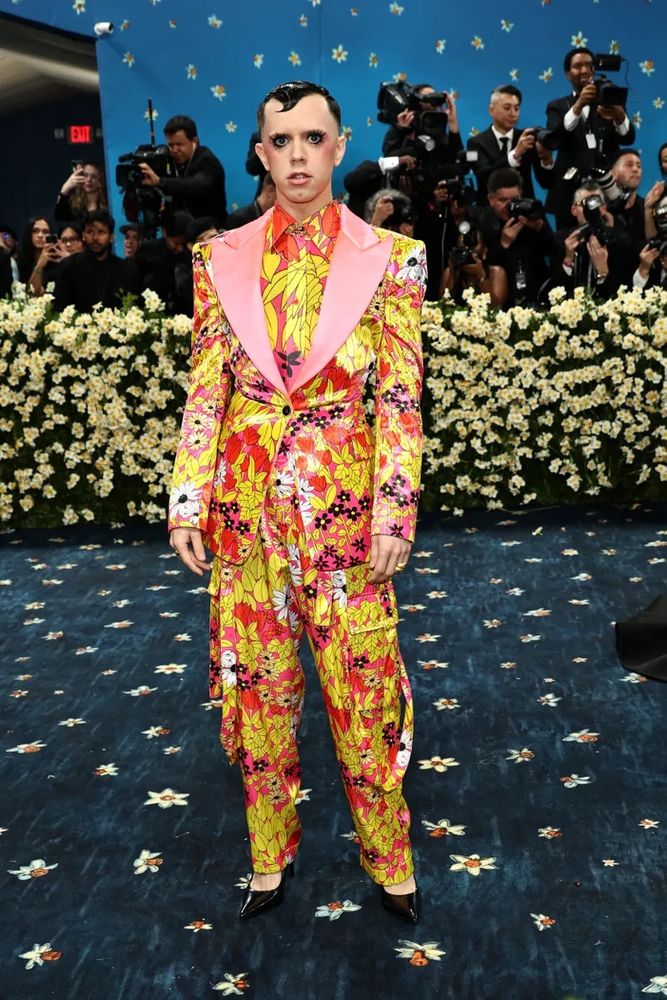
it’s like…I appreciate the effort but this falls in the same category as that earlier one where it just kind of reads like a character from an insufferable Lewis Carroll adaptation
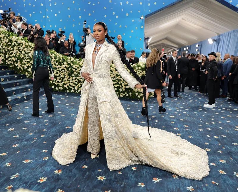
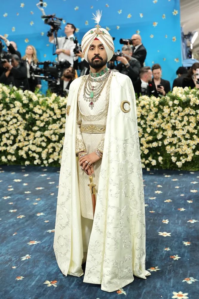
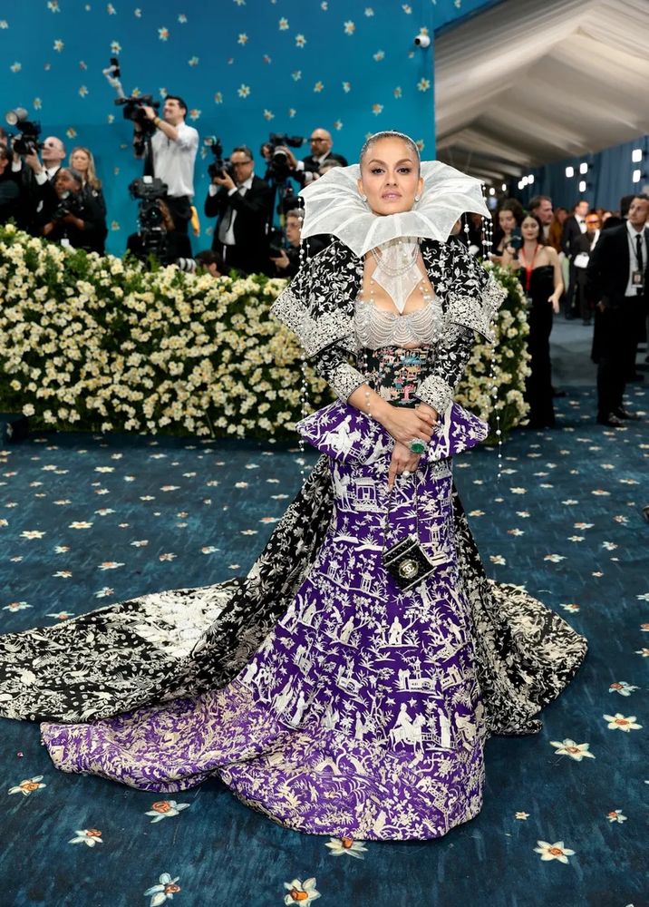
I saw the one on the right earlier and fell instantly in love. The colors! The fabrics! The jewelry!
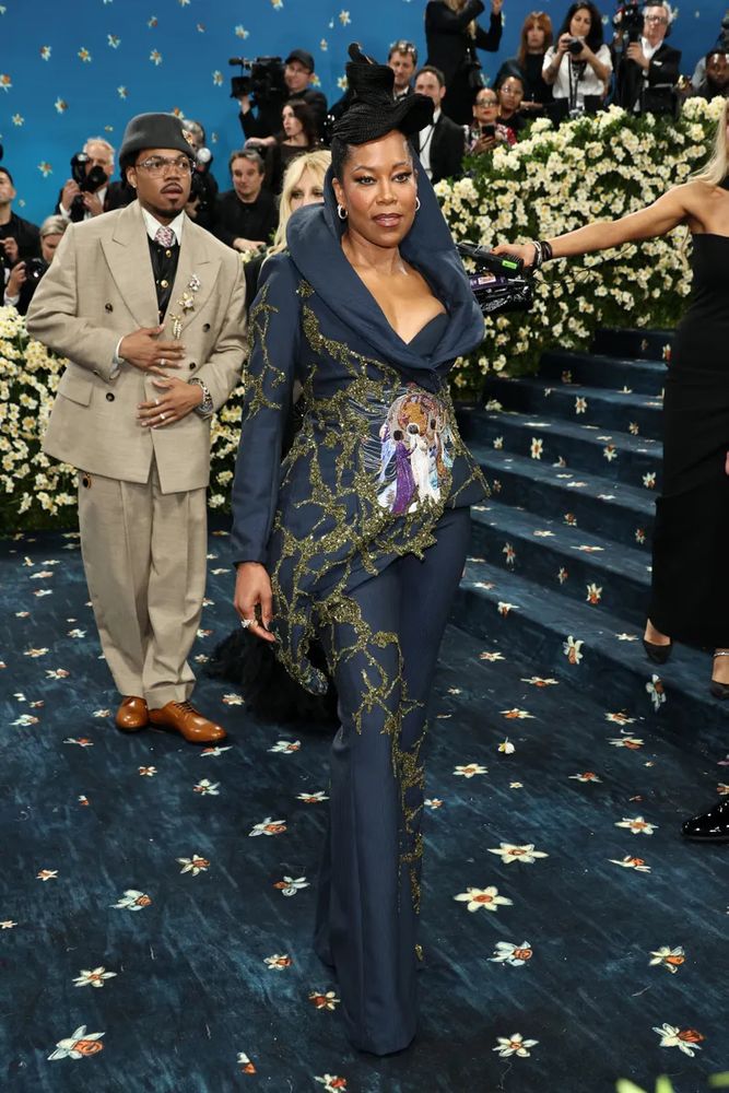
QUEEN
he ALWAYS knows what he’s doing
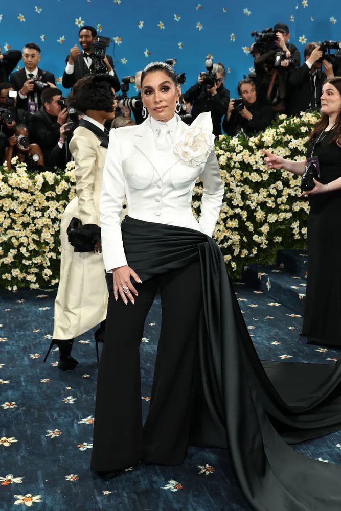
everything about this works, especially the mismatched halves of the jacket and even more especially that SUCCULENT jewelry situation
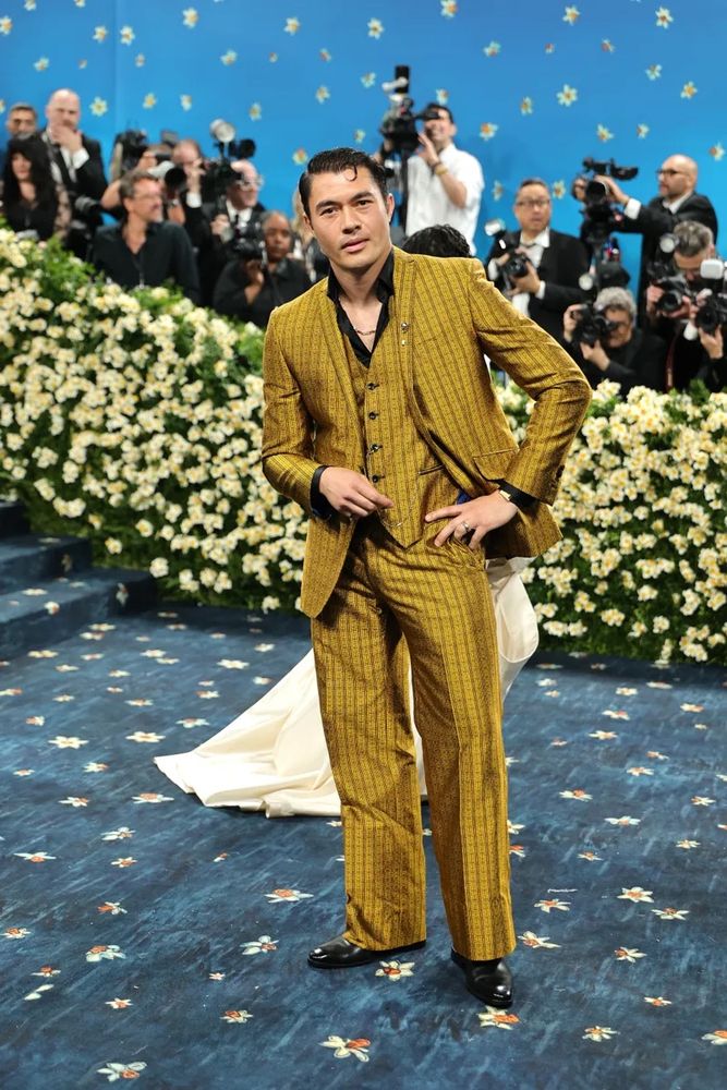
into it but he might have too slight a build for a fit this loose
color’s a little dull for her, I think, but on its own a great suit
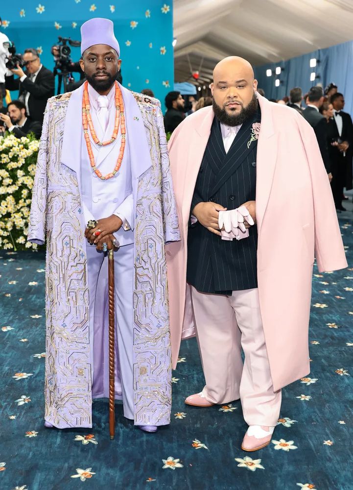
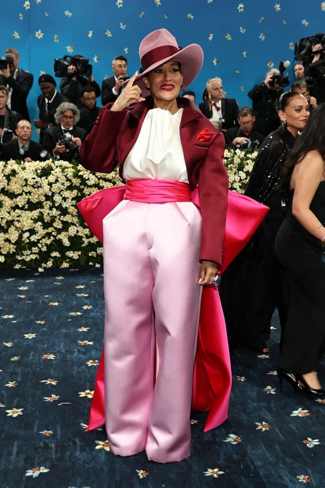
god that pink though
YES FINALLY ONE OF MY OTHER FAVES, I love Robert Wun and he really did himself proud here
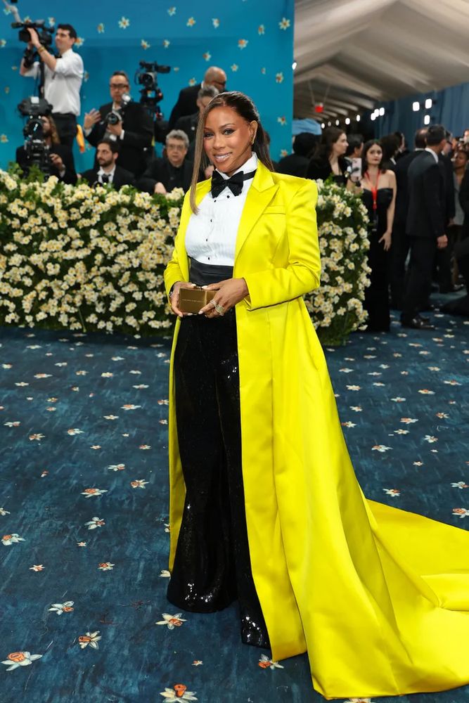
Fantastic color use here, the oxblood leather with that yellow?? yes please
okay a really good look but the black is….she shouldn’t wear black
I appreciate this more than I like it
god SO good
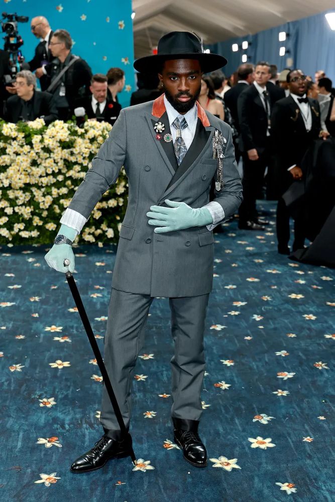
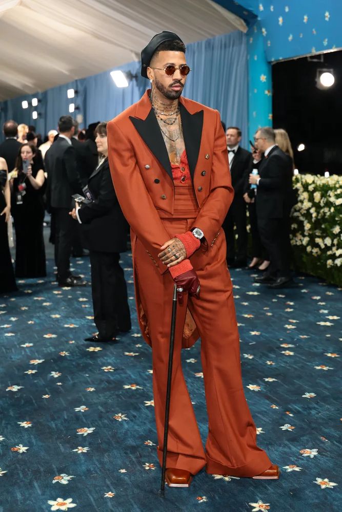
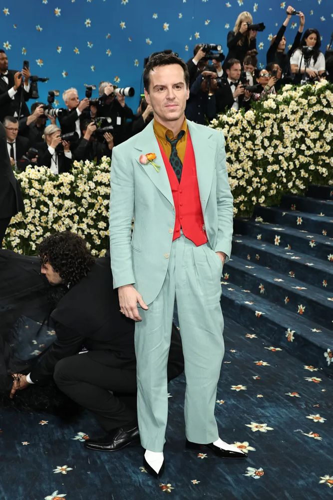
when you have riding to hounds at five and the opera at six
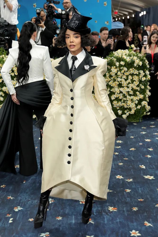
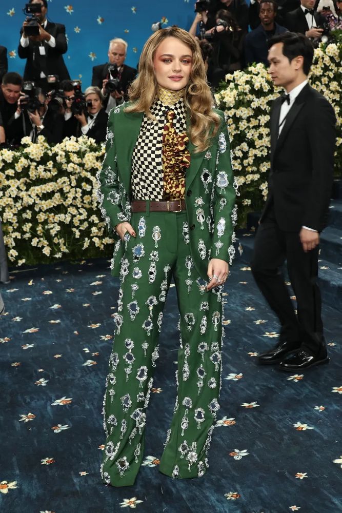
okay VERGING on the Alice in wonderland thing I keep complaining about but I think she’s making it work
May 7, 2025 02:26as always I have to reiterate that, no matter the event, I know who maybe 1/4 of these people are, so if they’ve done something notably good OR notably bad the odds are I haven’t heard about it
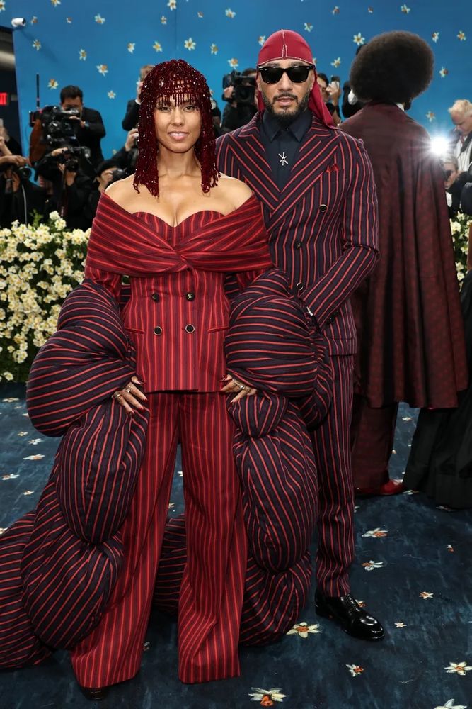
The exaggerated proportions here—so good. Like a fashion illustration brought to life
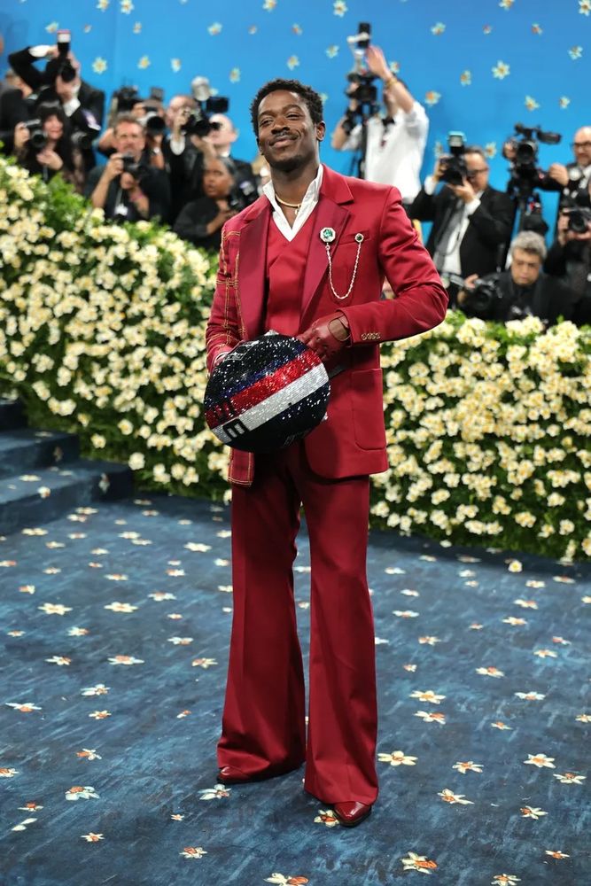
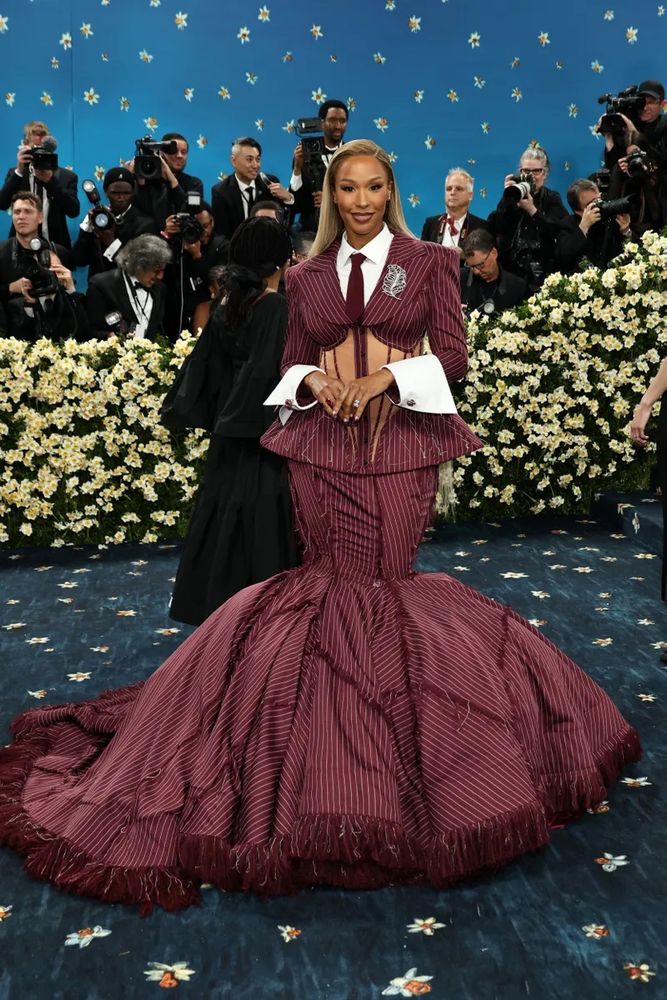
damn that’s a statement for sure (and I’m always delighted to see a Christopher John Rogers)
the bow really makes this work
I just want like. One pop of color. Or even more jewelry. Something to wake it up
I like it but I wish there was a little more adventurousness happening
not sure what this has to do with anything but I’m so happy to see it
this is another case of looking absolutely stellar but not in a way that makes sense for the theme
more good colors hello
minor ground rule: I don’t mind disagreement, I do mind flat contradiction. if I’m clearly enthusiastic about something, what’s the point in telling me I’m wrong? would you do that irl? if yes, that’s rude and unpleasant and I hate you. if no, don’t do it here either.
want (the coat, that is)
I have been asked specifically what I think of Lorde’s choices here. interesting, especially going full backless, but maybe not as on theme as one might wish
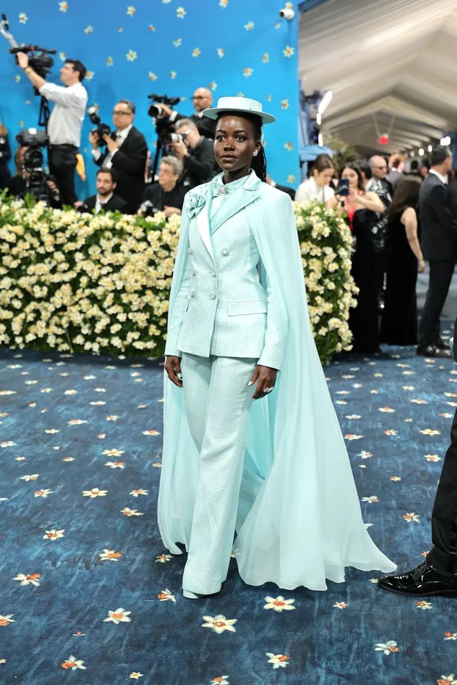
So much done right. Especially that giant flower. And everything else
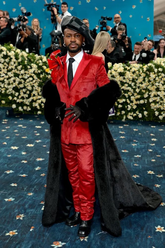
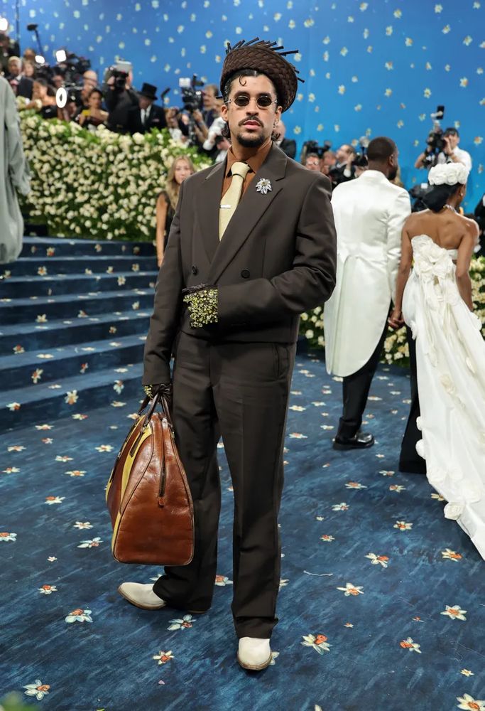
this is a lot of fun! I dunno about the bag, it looks like he has a plane to catch, but the rest of it!
There’s been a lot of Miu Miu this time but only a few of them have made sense to me without further research
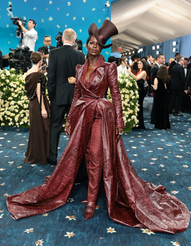
Lupitaaaaaaa
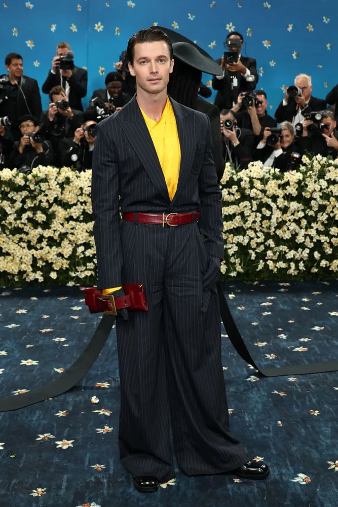
I’m sad that the blue bow doesn’t go with the suit, it’s someone else behind him
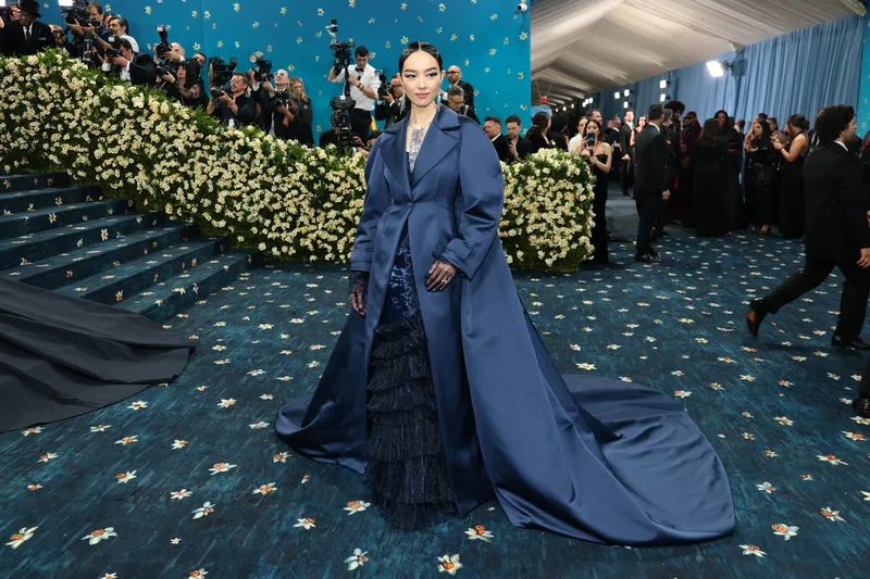
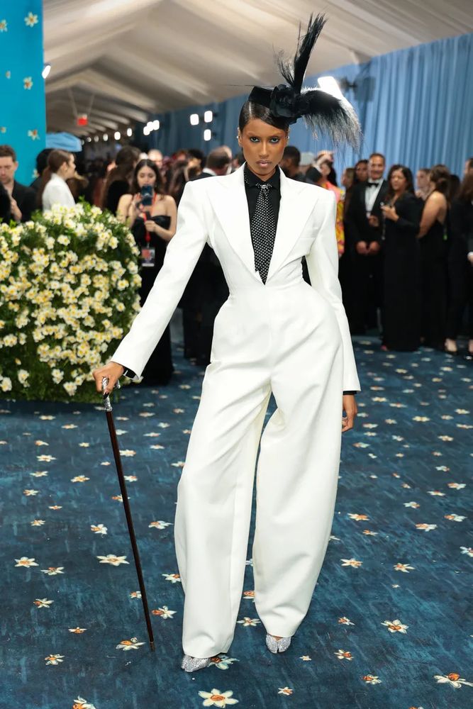
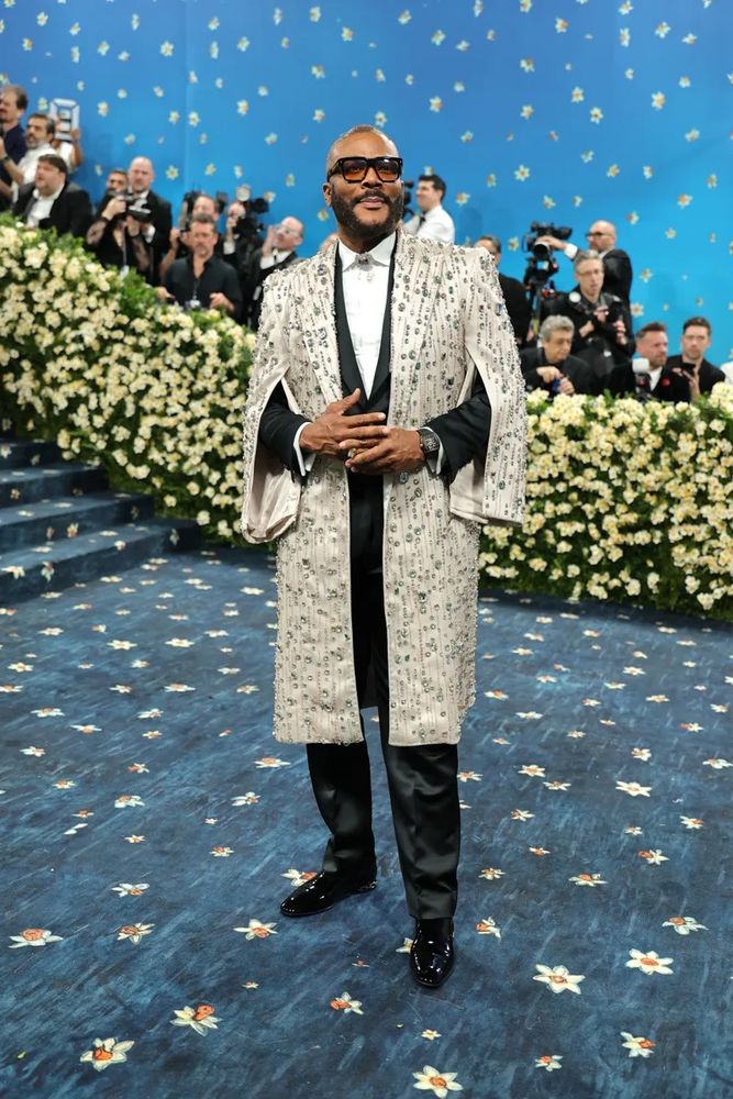
An excellent silhouette
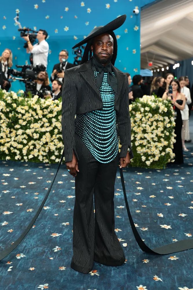
hhhhhhhiiiiiiiiiiiii Keith
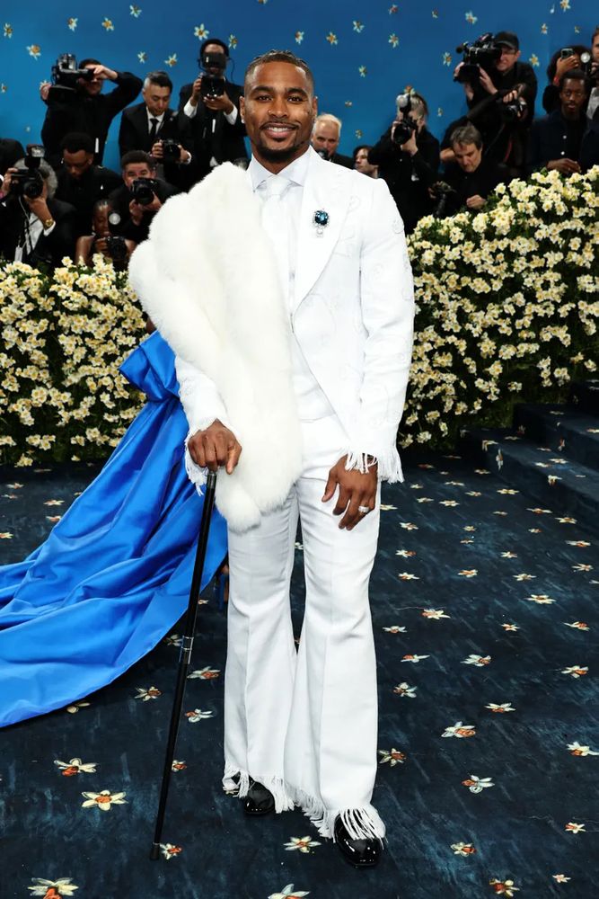
I don’t love the giant K but I DO feel like some part of me leveled up just looking at this
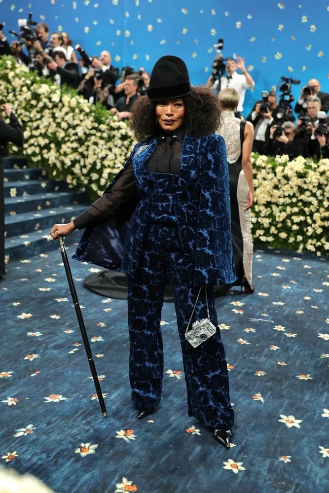
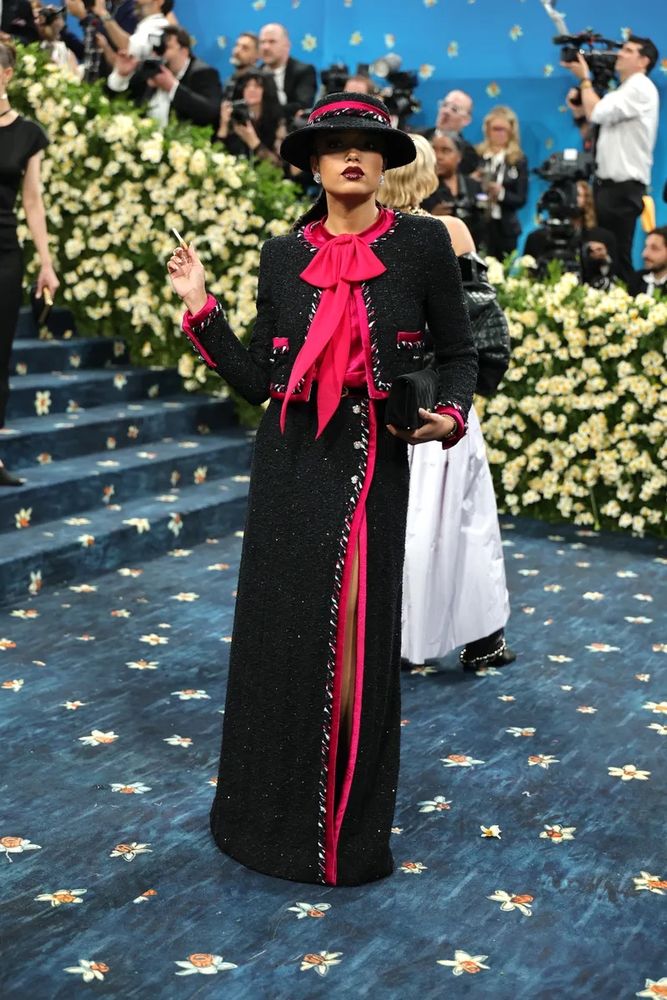
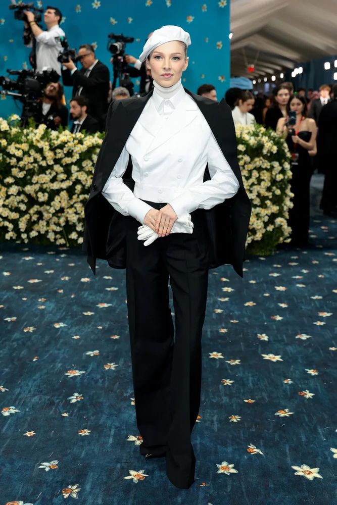
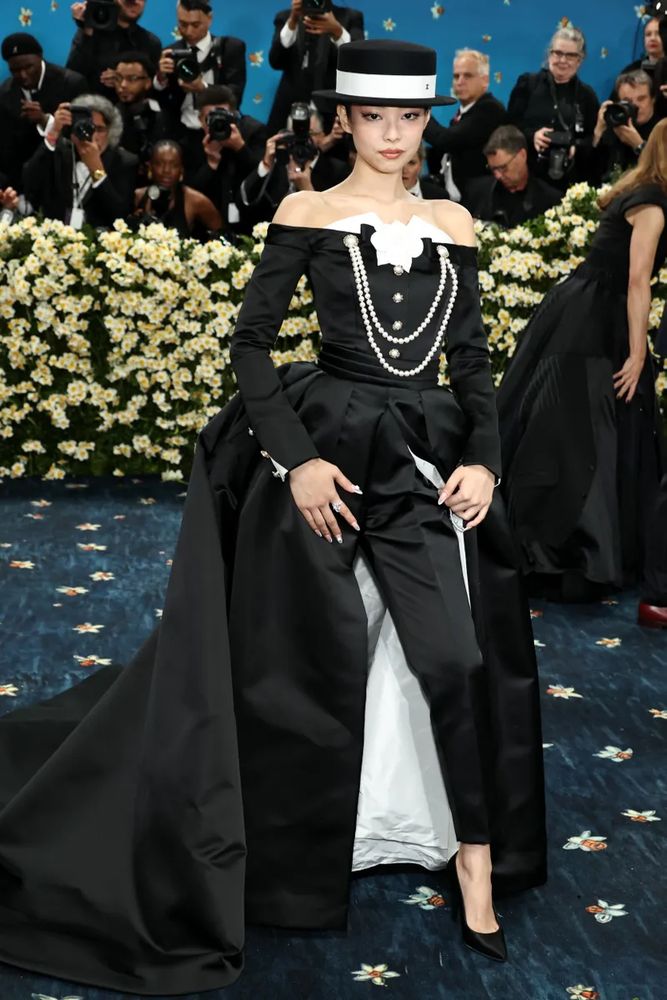
the pearls, the white lining, the hat!
[This post was deleted]
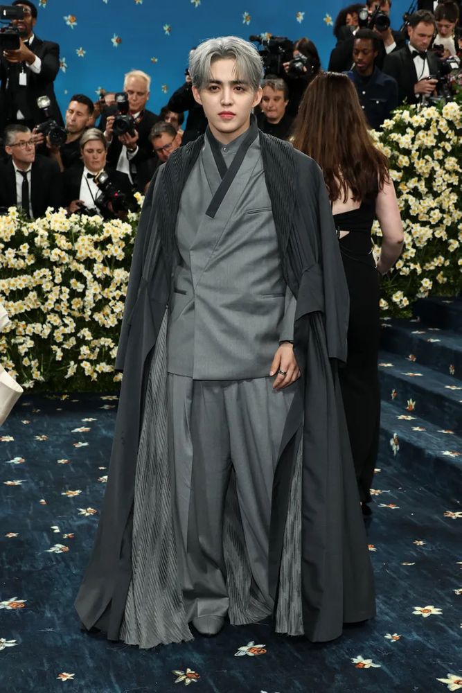
It's a little steampunky for me wrt the theme, but it's an interesting look that I enjoy seeing for sure.
this is big Wonka vibes