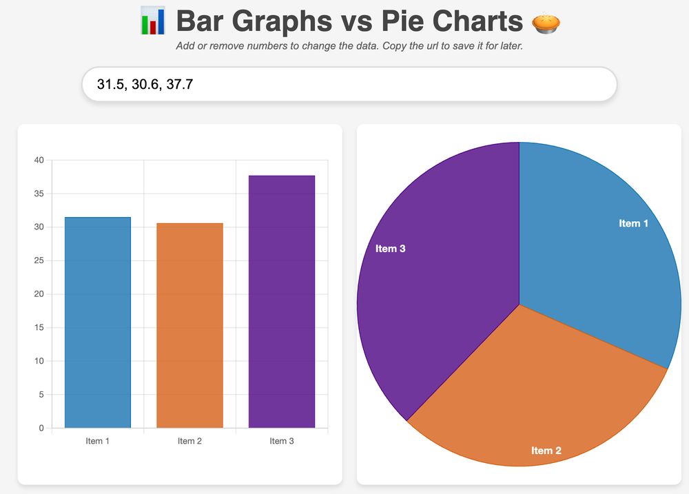
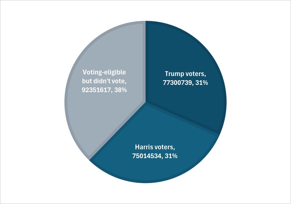
This is a good example where the "feel" of data can really vary by a simple chart change - from pie chart to bar graph.
While the 🥧 pie chart looks like 3 roughly-equal groups of people, the "didn't vote" group jumps out in a 📊 bar graph
Same data plotted below:
barvpie.netlify.app?numbers=31.5...A visualization of the razor thin margin of this election.
Of the 244+ million voting-eligible population:
31.5% voted for Trump
30.6% voted for Harris
37.7% did not vote
Popular is not a word that would accurately describe Trump or the MAGA movement.