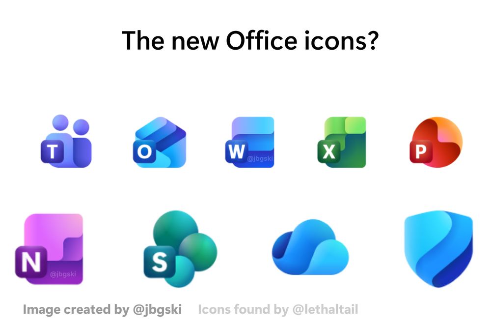
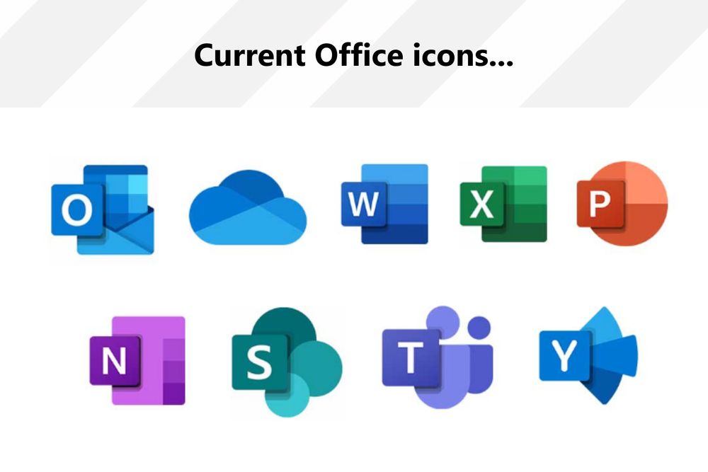
- New icons hot but old icons are so peak too
- looks like Microsoft is looking to refresh and redesign their Office icon set. some are pretty cool, but others are too round for my taste. anyone else feel the same?
- aero fluent ahh vibes
- It's looks like we back to smooth rounded lines
- I really hope they go for this new aesthetic, it looks so darn cool and futuristic. Heck, it might even be a glimpse of what Windows 12's design will look like. Will it be called Fluent 3, or something different?